Sorry friends, that I said I would be back in a week and flaked. But here I am!
What's up today:
1. Paint Shop Pro Tip
2. My First Freebie
1. Paint Shop Pro Tip #2
So here is today's Paint Shop Pro tip. It is really simple, but it makes a difference for my pages. Posting pages on the web, I have to downsize them. I save one copy at no less than 200pixels per inch to print, and one at 72 ppi to post in galleries. When I shrink my pages, sometimes my text and some shapes look terrible. I don't know why, but I discovered something that helps. Any vector layers in Paint Shop Pro (I use X1) do better if I convert them to raster layers before I save. Ok, ok, I will back up.
In PSP there are three types of layers. Here we are concerned with 2 of them. A raster layer is programmed in pixels, little colored dots. A vector layer is programmed as complete shapes such as a square, a star, or a letter. In PSP, text is automatically made on a vector layer when you first type it. That is the only way you can edit it.
Once it is all fixed, you can change it to a raster layer, but then it is just a bunch of pixels. So you can change the color and so forth, but you can't re-write it or change the font. Vector objects do not lose quality by resizing like raster graphics do so it is best to do all the editing in that mode.
But for some reason, when I convert to raster or merge it with a raster layer below it, the text looks better in the compressed jpeg. It is hard to see at this size, but I will try to demonstrate. On the page below, the age of my friend Miriam is written on each frame as the number of months. I forgot to change that text to raster or merge it with the frames. However, the other text e.g. "..BA..BY.." had been changed. The text for the ages has way worse jpeg artifacts (little marks around it). Can you see what I mean?
 [Credits: Background from Hearts kit by Stellarific Creations.Glitter and journal tag from Sea of Stars by Stellarific Creations, available at: http://www.stoneaccentsstudio.com/store/index.php?main_page=product_info&cPath=13_40&products_id=958. Photo strip frames by KariQ. Papers inside the frames (recolored) from Going in Circles by Joni, available at: http://ahhhscrap.com/catalog/index.php?main_page=product_info&cPath=49_48&products_id=235Fonts Hearts Delight by 2peas and First Grader.]
You can convert a layer a few different ways. One way is go to layers menu and choose convert to raster. Or right click on the layer on the layers palette and choose convert to raster. I don't think you can convert from raster to vector, so your only chance to undo is the Undo command (control+z).
2. My First Freebie Offer
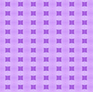
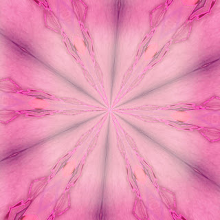
Ok, here goes: I have two backgrounds available as freebies. I need feedback to see how you like them. I won't require it like I did last time (I got no response), but I greatly appreciate it. The previews are resized and additionally compressed. The actual files are 2400X2400 pixels. Here they are:

blue
 pink
pink
Terms of Use: Please do not share my 4shared link. If you would like to share these freebies, please direct people to this blog. These freebies are for personal use only, not for any use that generates income. If you post pages that use these freebies, whether as is, recolored, or otherwise altered, please give me credit (Jennifer Hodges). Thank you and Happy Scrapping!
 [Credits: Background from Hearts kit by Stellarific Creations.Glitter and journal tag from Sea of Stars by Stellarific Creations, available at: http://www.stoneaccentsstudio.com/store/index.php?main_page=product_info&cPath=13_40&products_id=958. Photo strip frames by KariQ. Papers inside the frames (recolored) from Going in Circles by Joni, available at: http://ahhhscrap.com/catalog/index.php?main_page=product_info&cPath=49_48&products_id=235Fonts Hearts Delight by 2peas and First Grader.]
 Terms of Use: Please do not share my 4shared link. If you would like to share these freebies, please direct people to this blog. These freebies are for personal use only, not for any use that generates income. If you post pages that use these freebies, whether as is, recolored, or otherwise altered, please give me credit (Jennifer Hodges). Thank you and Happy Scrapping!


